Paristique est une impressionnante carte en ligne qui permet de découvrir d’un clic l’origine de la plupart des rues et lieux de la capitale française.
Get Started for FREE
Sign up with Facebook Sign up with X
I don't have a Facebook or a X account


 Your new post is loading...
 Your new post is loading...
Your new post is loading...
Paristique est une impressionnante carte en ligne qui permet de découvrir d’un clic l’origine de la plupart des rues et lieux de la capitale française.

No comment yet.
Sign up to comment

luiy's curator insight,
September 2, 2014 5:01 PM
The Open Data Barometer takes a multidimensional look at the current adoption level of open data policy and practice around the world. Three main categories are considered as part of the barometer:
- Readiness - identifies how far a country has in place the political, social and economic foundations for realising the potential benefits of open data. The Barometer covers the readiness of government, entrepreneurs and business, and citizen and civil society.
- Implementation - identifies the extent to which government has published a range of key datasets to support innovation, accountability and more improved social policy. The barometer covers 14 datasets split across three clusters to capture datasets commonly used for: securing government accountability; improving social policy; and enabling innovation and economic activity.
- Emerging impacts - identifies the extent to which open data has been seen to lead to positive political, social and environment, and economic change. The Barometer looks for political impacts – including transparency & accountability, and improved government efficiency and effectiveness; economic impacts – through supporting start-up entrepreneurs and existing businesses; and social impacts – including environmental impacts, and contributing to greater inclusion for marginalised groups in society.
These factors have been combined onto a Radar chart, this represents the countries barometer. |
luiy's curator insight,
September 2, 2014 5:13 PM
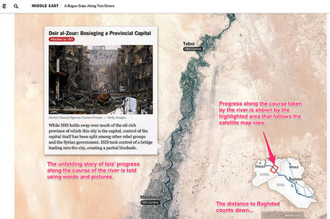
The above examples describe a wide range of geographical and geotemporal storytelling models, often based around quite simple data files containing information about individual events. Many of the tools make a strong use of image files as pat of the display. it may be interesting to complete a more detailed review that describes the exact data models used by each of the techniques, with a view to identifying a generic data model that could be used by each of the different models, or transformed into the distinct data representations supported by each of the separate tools. - See more at: http://schoolofdata.org/2014/08/25/seven-ways-to-create-a-storymap/#sthash.tWi68hgm.dpuf |