Your new post is loading...

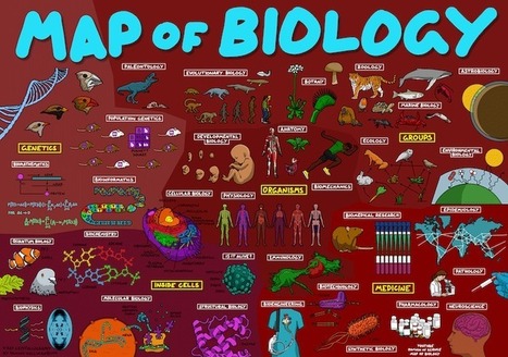

t's often easy to get stuck into a narrow view of what a particular field of study entails, but as Dominic Walliman reveals in his impressive science infographics, there's much more than meets the eye when thinking of particular STEM subjects. Walliman demonstrates the diversity and complexity of biology, chemistry, computer science, physics, and mathematics in visual maps that explore the breadth of each field.
Walliman, who also created animated videos exploring his science infographics, manages to pack all the shades of each complex field on one page. For instance, the Map of Mathematics travels from the origins and foundations of the field to the differences between pure mathematics and applied mathematics. Likewise, chemistry is divided between rules and different sub-topics like biochemistry and inorganic chemistry, with fun illustrations to clearly show what falls underneath each area.
Whether you are a scientist who feels like people never quite get what you do or a student who can't put their finger on how they might use their math or science degree, Walliman's infographics will come in handy. Consider them roadmaps to possible careers or cheat sheets to figuring out how quantum physics is related to the theory of relativity. Best of all, by studying the visual maps, it becomes easy to see how all these scientific fields overlap and fit together like a puzzle.