 Your new post is loading...
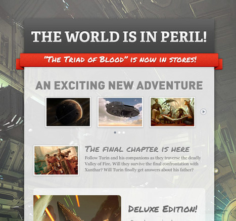
Creating your own images is also an excellent tactic for re-purposing text-only content into enticing images. Here are some examples: Turn quotes into an interesting slideshow, post an event announcement on a pretty picture, place stats onto eye-catching graphs, give a blog post title some pizzaz, create an infographic about the history of your biz, create a catchy, custom featured image for a video, etc. The possibilities are endless.
To help you create images that get BuzzFeed-worthy engagement, here are 13 of our favorite and easy-to-use visual content creation tools....
Via Jeff Domansky
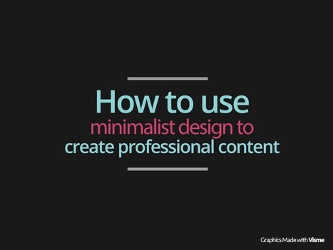
Sometimes less is more. Learn these simple tricks to take advantage the minimalist design trends in graphic design to create more professional presentations and
Via Baiba Svenca
Jim Lerman's insight: Three methods for using photos to enhance presentations: 1. Deepen Meaning 2. Make it Personal 3. Create a Distinct Look
Via Baiba Svenca, Elke Höfler

|
Scooped by
Jim Lerman
|
How narrative intelligence can help everyone design solutions and generate useful data.
Karen Dietz's insight: I really like how this author, Denise Withers, talks about how our narrative intelligence (our knowledge of story structure, and our story thinking ways) can be applied in business to solve problems, help decision making, and be used as another design process to improve innovation.
Love it, love it. These points apply to any business or nonprofit. Withers shares anecdotes to make her points, and offers great advice.
As an aside -- my friend and story colleague Madelyn Blair and I were just talking the other day about narrative intelligence and a book she'd like to write about it with another story colleague Denise Lee. Get busy Madelyn and Denise! We need that book :))
This is my first slide deck designed to share. It reflects a summary and applied practice of some basic lessons learned about data visualization and information
Via Baiba Svenca
|
|
Scooped by
Jim Lerman
|
"Every year, we put together an overview of the current iteration of the design process we’re teaching, along with some of our most-used tools. The guide was originally intended for recent graduates of our Bootcamp: Adventures in Design Thinking class. But we’ve heard from folks who’ve never been to the d.school that have used it to create their own introductory experience to design thinking. The Bootcamp Bootleg is more of a cook book than a text book, and more of a constant work-in-progress than a polished and permanent piece."
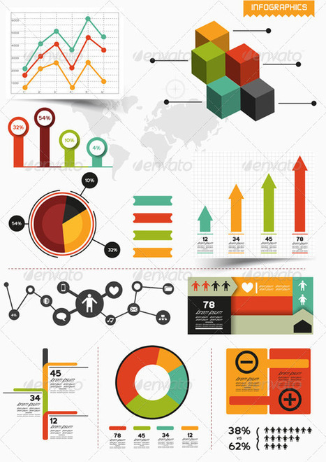
Infographics have become quite popular nowadays since they help people find the right path in the chaos of the crowded online world. So, it is understandable why designers appreciate this trend so much. However, it's always useful to learn a few tips and pieces of advice. In this infographic and related article, you will get more details about design, typography, content, color and more...
Via Lauren Moss
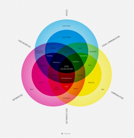
Information graphics or infographics are graphic visual representations of information, data or knowledge intended to present complex information quickly and clearly. The process of creating infographics can be referred to as data visualization, information design, or information architecture. In newspapers, infographics are commonly used to show the weather, maps, site plans, charts and graphs for statistical data. These infographic element kits are all editable vector shapes in organized file formats, for use in presentation, print files or web site graphics.
Via Lauren Moss
Can we apply concepts used in video production to Prezi design? Let's find out! In this Prezi I pull terms from Bruce Block's book The Visual Story: Seeing the Structure of Film, TV, and New Media. Let me know what you think.
Via Baiba Svenca
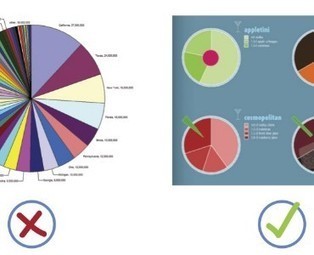
When it comes to visualizing data, it’s important to pick the right graph and the right kind of data range. Make it too detailed, and information gets lost and the reader leaves confused. Too simplified, and your data’s integrity is weakened. Choosing the right infographic element shouldn’t be an art but common sense. After all, it’s an infographic – readers should get the gist of things at first glance and not have to get crossed-eyed in making sense of things...
Via Lauren Moss
People who create infographics do their work partly because they believe infographics are a great way to communicate information. Since the people in this field also need to communicate information about their work, it was inevitable that infographics about infographics would eventually be created. Here are 11 of those meta infographics.
Via Lauren Moss
|
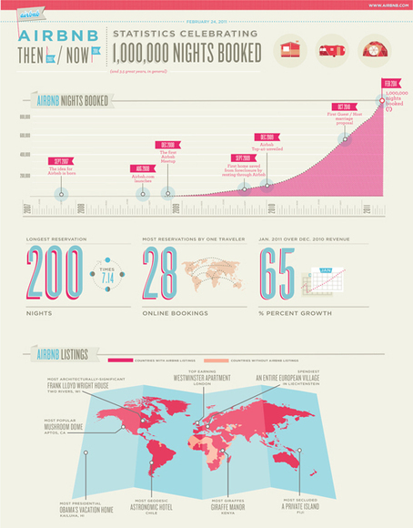
'In our Data Visualization 101 series, we cover each chart type to help you sharpen your data visualization skills. Bar charts are a highly versatile way to visually communicate data. Decidedly straightforward, they can convey the message behind the numbers with impact and meaningful clarity, making complex data easy to understand at a glance.'
Via Lauren Moss, Jim Lerman
|
|
Scooped by
Jim Lerman
|
This is our methodology at The Design Gym.
"In education, design thinking empowers students to realize that they can create their own futures by borrowing frameworks from other areas, which allows them to design their own participation and experiences. For example, game designer Katie Salen has talked about her students experiencing video game design and implementing those principles into the classroom; she said her students interact within a framework that allows them to take on social challenges as designers."
Information graphics or infographics are graphic visual representations of information, data or knowledge intended to present complex information quickly and clearly. The process of creating infographics can be referred to as data visualization, information design, or information architecture. In newspapers, infographics are commonly used to show the weather, maps, site plans, charts and graphs for statistical data. These infographic element kits are all editable vector shapes in organized file formats, for use in presentation, print files or web site graphics.
Via Lauren Moss
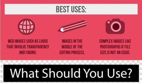
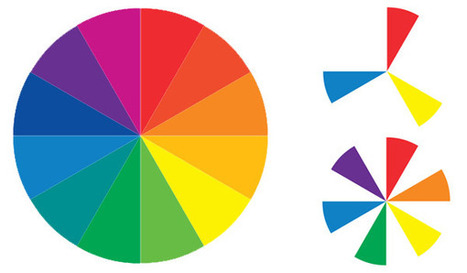
Sometimes the toughest step in building a new website or redesign can be the conceptual ones. Selecting a color palette is one of them that can be tough if you don’t have the right tools. So where do you start?
It all comes down to basic color theory and the color wheel. That same tool that teachers used in school really is the basis for how designers plan and use color in almost every project from the simplest web page to expansive brands with multiple sites and campaigns...
Via Lauren Moss
Can we apply concepts used in video production to Prezi design? Let's find out! In this Prezi I pull terms from Bruce Block's book The Visual Story: Seeing the Structure of Film, TV, and New Media. Let me know what you think.
Via Baiba Svenca
Infographics are everywhere, and cover everything from biscuit-dunking to what makes Olympic swimmers tick. We've trawled the web to find the best of the bunch - just look what we've uncovered!
Via Lauren Moss
A fable about using design to help your audience see your message clearly. And what to avoid. For directors, designers, instructional designers, and presenters.
Via Baiba Svenca
|


A picture speaks a thousand words - some good resources here for visual content and creation to add a visual dimension to your messages, which tend to perform much better for opens and clicks than text alone.
Content is shared in many forms. These tools make it pretty easy to get creative.