Into the Driver's Seat
454.8K views | +34 today
Follow
Into the Driver's Seat
Building learners' independence through thoughtful technology use
Curated by Jim Lerman
Your new post is loading...
Rescooped by Jim Lerman from visual data
Scoop.it!

New Website Visualizes Human Activity in Cities Across the World

New Website Visualizes Human Activity in Cities Across the World | Into the Driver's Seat | Scoop.it

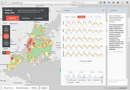
The SENSEable City Laboratory at MIT has developed a new tool with Ericsson to better understand human behavior. "ManyCities" is a new website that "explores the spatio-temporal patterns of mobile phone activity in cities across the world," including LondonNew YorkLos Angeles and Hong Kong. Taking complex data and organizing it in a intuitive way, the application allows users to quickly visualize patterns of human movement within the urban context down to the neighborhood scale. You can imagine how useful a tool like this can be for urban planners or even daily commuters, especially once real time analytics come into play.


Via Lauren Moss
No comment yet.
Rescooped by Jim Lerman from visual data
Scoop.it!

30 Tools for Data Visualization

30 Tools for Data Visualization | Into the Driver's Seat | Scoop.it

During the past few years the demand regarding Data Info-graphics has increased in volume and demand as well as in clarity. The range of technologies available by which to collect and examine data is constantly on the rise- both in web and desktop applications, which provide several great interfaces.
From a technological aspect , such tools have created efficiency based models which have gone onto disrupting existing paradigms of the past. These vary and range from data synthesis to data visualization encompassing every type of data.

Within this scope, such new tools are continually emerging whose main purpose is to- simplify the process within being able to harness data in lending impact and insight generation...


Via ghbrett, Lauren Moss
No comment yet.