

You don’t need to be a seasoned data scientist or have a degree in graphic design in order to create incredible data visualisations.
Get Started for FREE
Sign up with Facebook Sign up with X
I don't have a Facebook or a X account


 Your new post is loading...
 Your new post is loading...
Your new post is loading...
You don’t need to be a seasoned data scientist or have a degree in graphic design in order to create incredible data visualisations.
Baiba Svenca's insight:
A great list of tools for creating visual content (diagrams, charts, infographics, word clouds, maps etc.) for your presentations. 

Tired of sending out the same old static PDFs, spreadsheets or links from Google Docs?
Baiba Svenca's insight:
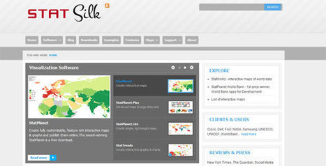
Silk is a cool tool for publishing your data online and make them interactive. Upload images, tables, videos, maps, spreadsheets, and create visualizations that can be embedded on other sites. Silk lets you collaborate with others. At present Silk account, either individual or team, is free.

Miguel Paul Trijaud Calderón's curator insight,
October 1, 2014 1:31 AM
Silk - Present your KPIS and figures. Export the data from your spreadsheet automatically.
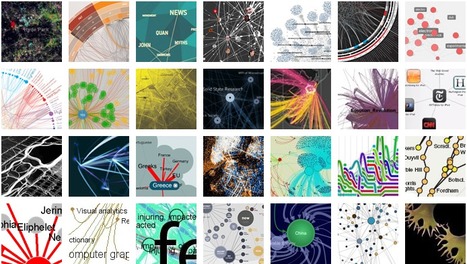
Visualcomplexity.com is a unified resource space for anyone interested in the visualization of complex networks. Great source of information for projects and presentations.

bricoleuric's curator insight,
March 11, 2013 12:18 PM
Nice work for generating simple insights from complex systems
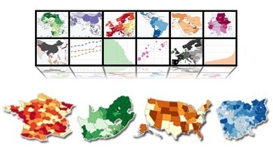
From simple charts to complex maps and infographics, Brian Suda's round-up of the best – and mostly free – tools has everything you need to bring your data to life... A common question is how to get started with data visualisations. Beyond following blogs, you need to practice – and to practice, you need to understand the tools available. In this article, get introduced to 20 different tools for creating visualisations... Via Lauren Moss

Randy Rebman's curator insight,
January 28, 2013 12:33 PM
This looks like it might be a good source for integrating infographics into the classroom.
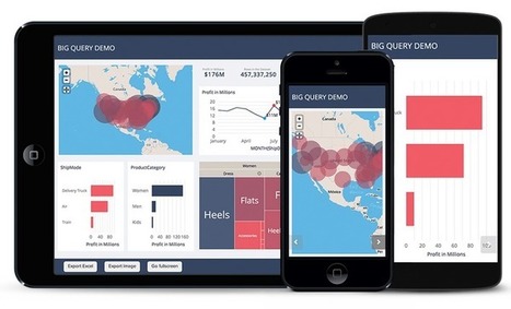
Creating Interactive Maps and impressive visualizations for presentations is something that many presenters may wonder how-to in order to impress the audience...
ChartsBin is a web-based data visualization tool that will allow everyone to quickly and easily create rich interactive visualizations with their own data... Download charts from the extensive chart library or create your own.
From
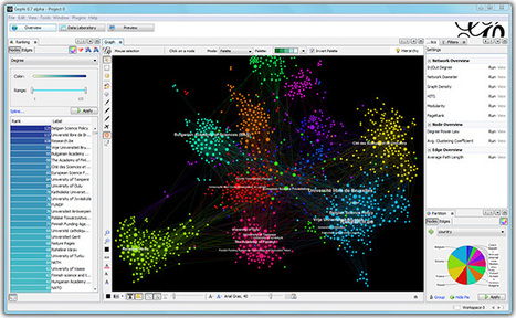
gephi

Gephi is an open-source software for visualizing and analyzing large networks graphs. Gephi uses a 3D render engine to display graphs in real-time and speed up the exploration.
|

Professional infographic designers rely primarily on a core vector graphics software program to create their infographics designs. The main advantage is that all the icons, charts, images, illustrations, and data visualizations are treated as separate objects that can be easily moved, resized, overlapped, and rotated.
Baiba Svenca's insight:
Wonderful and easy tools for creating infographics and presentations. Start using any of them for free, then go to a paid version if you wish.

Melissa Marshall's curator insight,
October 15, 2014 12:56 AM
These tools are mostly web-based and provide ways in which students can visually represent their ideas. 
Stephan Hughes's curator insight,
October 21, 2014 9:27 AM
Getting students to create infographics and using them ourselves to present information are more than justifiable reasons for these kind of tools

From
vizalizer
Vizalizer simplifies the creation, analysis and generation of data visualization through a Social Network that brings together publishers with colleagues and readers, to create content for its analysis and discussion, use in presentations, publications...
Baiba Svenca's insight:
Vizalizer is an interesting tool that lets you create infographics and data visualizations. In my opinion, it is more suitable for business but ingenious people may find how to use it in education as well. The basic version is free but it has limitations.

Innovative design crosses over all aspects of education. The American Society for Innovation Design in Education, or ASIDE, seeks to infuse curriculum with new approaches to teaching and thinking. Don't miss the presentation The 8 Hats of Data Visualisation by Andy Kirk.

Fadhil's curator insight,
September 4, 2013 1:00 PM
"Doing data visualitation is less a technology problem, more to a people problem."

ChartsBin is a web-based data visualization tool that will allow you to quickly and easily create rich interactive visualizations with their own data to be used in PowerPoint presentations or Keynote slides...
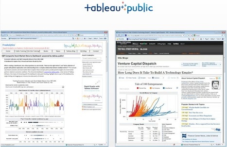
Tableau Public is a free tool that brings data to life. Easy to use. Spectacularly powerful. Data In. Brilliance Out.

himanshi lamba 1's comment,
August 29, 2016 1:55 PM
Hey, really interesting post!
I agree with you that Business Intelligence (BI) is a set of tools and techniques that process raw data into meaningful information and useful statistics that are used in business analysis, which can help in achieving beneficial results. Here I need to mention a very useful BI tool that helped me a lot in successfully visualizing my data. Tableau is a very well-known BI tool that creates visualization for data and enables users to communicate with the data to make effective decisions. Have a look at http://www.actiknow.com/tableau-consulting/ to get knowledge about this tool.
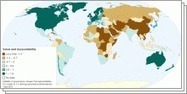
Create interactive maps using the award-winning free StatPlanet software. Explore thousands of world stats through interactive maps and data visualizations.
|


Ca donne envie d'essayer : nuage de mots, graphiques, cartes... Par Christopher Ratcliff @ Econsultancy publié le 25/02
Check out how to add visualisations to your presentations.
197