


 Your new post is loading...

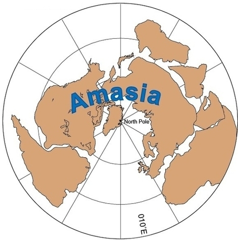

Fifty million to 200 million years from now, geologists expect Earth's continents to smash together into one big supercontinent, just as they've done repeatedly in our planet's distant past — and a new computer model suggests that the Arctic Ocean...
This graphic displays the fluidity of the plate tectonic systems, and instead of thinking about what happened during the era of the dinosaurs, looking into the future provides an interesting perspective the dynamism of Earth systems (Disclaimer: this is one possibility on what might happen, there are other possible outcomes). In human geography, I use this map to discussion the concept of region: regions are not static, but the the Earth is put together is (sometimes literally) shifting beneath our feet.


The continental drift shows that 225 million years ago, Africa, Asia & Europe, North America and South America were touching while Antarctica and Australia were really close to those 5 continents. These 7 continents together were known as Pangea. 125 million years later North America, Africa and Europe elevated north in terms of latitude but to sum it up, North America, South America, Africa and Europe all drifted north in the world. Let's jump ahead 50 million to 200 million years from now. North America, South America, Europe and Africa can quite possibly all drift northward. As for Asia, the only difference between 225 million years ago and now is that Asia drifted east and barely drifted north. Also, I feel that Australia will barely make it to the equator since it barely drifted northward throughout the past 225 million years.