

Research and publish the best content.
Get Started for FREE
Sign up with Facebook Sign up with X
I don't have a Facebook or a X account
Already have an account: Login

A New Society, a new education!
238.4K views |
+8 today

Direct Proposals to organize a new Education in the Knowledge Society.
Curated by
juandoming
 Your new post is loading...
 Your new post is loading...
Your new post is loading...


Mary Westcott's curator insight,
March 1, 2016 10:14 AM
Maybe a tad too complex for our young students, but still a nice way of understanding the foundations of storytelling!! 
Marisa d's curator insight,
March 11, 2016 12:22 AM
Maybe a tad too complex for our young students, but still a nice way of understanding the foundations of storytelling!! 
Salena Argar's curator insight,
May 17, 2017 6:31 AM
Seven steps to the perfect story is a great visual representation of how to build a story. This clearly explains the process of how students can construct their narrative and the types of characters they will use. I would definitely use this in my classroom to help students understand the process of creating a narrative.
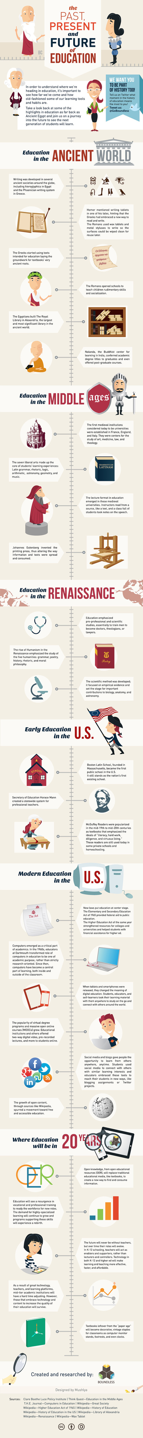
The folks at Boundless who last brought us the EdTech Buzzwords Infographic are back with The History of Education. The graphic takes a look at how formal education began, changes along the way, current day and predictions for the next twenty years. Via Gust MEES, Karen B Wehner, Maribel Bañares

Michael Stapleton's curator insight,
March 19, 2013 10:30 PM
The folks at Boundless who last brought us the EdTech Buzzwords Infographic are back with The History of Education. The graphic takes a look at how formal education began, changes along the way, current day and predictions for the next twenty years. 
Shelli Herseth's curator insight,
December 4, 2015 12:41 PM
A cool infographic on the history of education! #edlt561

Ness Crouch's curator insight,
February 6, 2013 1:39 AM
Very interesting summary of social media in schools. What sort of tools does your school utilise? 
Robert Blair's curator insight,
February 14, 2013 2:02 AM
I think that this is such a great visual for my generation. It is so representative of how we rely, and use technology to demonstrate common core values in the classroom. This is great but it also could be our achilles heel, we need to apeal to all types of learners and visual is just one, there are so many more type that must be catered to so that we can be affective.

To view or download a PDF version, click here: http://staysafeonline.org/download/document/294/protecting_the_internet_infographic.pdf
Via Gust MEES
![Innovative ICT in Education: Twitter [Infographic] | A New Society, a new education! | Scoop.it](https://img.scoop.it/rhcnyvTxCB2M1irpdb--TDl72eJkfbmt4t8yenImKBVvK0kTmF0xjctABnaLJIm9)
The latest ‘Training Tuesday’ for staff CPD was on the use of Twitter for professional development. Aims: What is Twitter? Sharing the benefits of developing your own PLN (Personal Lear...
Read more: http://mrwickenspe.wordpress.com/2012/05/22/innovative-ict-in-education-twitter/
Via Gust MEES, Maria Palaska

Visste du at det ikke finnes to personer med nøyaktig lik øyenfarge? Visste du at alle mennesker med blå øyne kommer fra samme stamfar? Via Sakis Koukouvis, Naturfagsbloggen
|
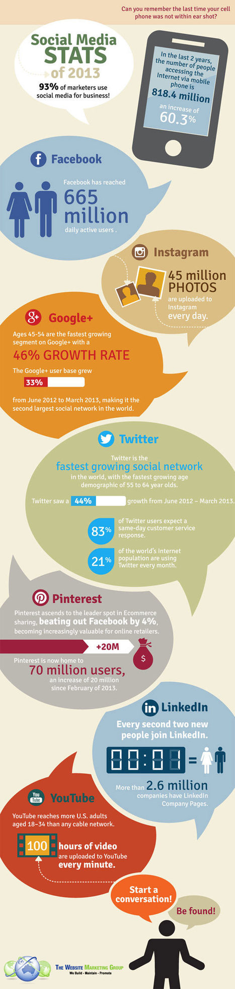
The Social Media Stats of 2013 an infographic If you are using social media marketing Via WordPress SEO & Social Media, John van den Brink, Terheck

WordPress SEO & Social Media's curator insight,
October 5, 2013 3:38 AM
The Social Media Stats of 2013 an infographic /@BerriePelser
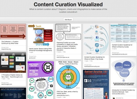
What is content curation about? Diagram, charts and infographics to make sense of the curation conundrum Via Robin Good

Monica S Mcfeeters's curator insight,
March 30, 2014 9:18 AM
This will be helpful to share to those wondering about content curation. 
Jeff Domansky's curator insight,
September 1, 2014 11:53 PM
Valuable collection of the art of curation from Robin Good.
![How Teachers Can Start Curating Information for Professional Development [Infographic] | A New Society, a new education! | Scoop.it](https://img.scoop.it/x2S7m-nvkwhh2bn1YCFA0jl72eJkfbmt4t8yenImKBVvK0kTmF0xjctABnaLJIm9)
In Professional Learning in the Digital Age: The Educator's Guide to User-Generated Learning, Kristen Swanson shows educators how to enhance their pro... Via Gust MEES

Louise Robinson-Lay's curator insight,
March 2, 2013 10:56 PM
Handy infographic outlining ways to use the web as a PD tool.
![[Infographic] Leadership Qualities | Leadership In Action | A New Society, a new education! | Scoop.it](https://img.scoop.it/1yRjzWxlg6o8L-YQN5Ltnzl72eJkfbmt4t8yenImKBVvK0kTmF0xjctABnaLJIm9)
We put together an infographic that describes some leadership qualities that can be developed and put in your own skills filing cabinet. ... Via Ana Cristina Pratas, Gust MEES, Virginia Pavlovich

Ali Godding's curator insight,
February 21, 2013 11:14 AM
There it is... the challenge of management on one page. Being all of these things is a tall order. Many are up for it, few really live it.... great infographic!
While not everyone can make infographics from scratch, there are tools available on the Web that will help you create your very own infographics. In this article, we’re listing more than 20 such options to help you get your messages across to your readers, visually.
What About Me? "What About Me?" is a personalization tool that produces colorful infographics that display your social media habits automatically from Facebook, Twitter and YouTube. The tool is provided by Intel. Create an infographic of your digital life and become inspired by the people you know, the things you see, and the experiences you have online.
Vizualize.me Vizualize.me allows you to create an online resume format that is beautiful, relevant and fun, all with just one click. It enables you to express your professional accomplishments in a simple yet compelling personal visualization, and will help optimize your LinkedIn Profile to get a kickass Visual Resume.
Piktochart With Piktochart, you get to create an innovative Infographic using a combination of different types of visualizations: themes, icons, vectors, images and chart exporter. Drag-and-drop and click your way through color schemes, shapes and fonts, then export the materials as static or html to easily embed it for use at your site.
easel.ly Easel.ly is a fun tool to create your Infographics with drag and drop features and a simple interface. You can easily create and share visual ideas online, supported by ‘vhemes’ or visual themes that help you get started from the preset Infograpic style. Drag and drop a ‘vheme’ onto your canvas to turn your idea into a full infographic.
Visual.ly (http://goo.gl/issJu) Visually helps you customize infographics in seconds, and no, you don’t have to be an analyst or designer to make infographics with Visually Create. Visual.ly allows you to also discover infographics and favorites from other users.
Infogr.am (http://goo.gl/UaK3G) Infogr.am is a simple yet most exciting way to create static and interactive infographics. Import raw data to Infogr.am, and the site’s online tool will help you turn that data into a nice looking chart or full-blown infographic in minutes.
Many Eyes (http://goo.gl/9SKr5) Many Eyes is an experiment by IBM Research and the IBM Cognos software group with a simple belief: ‘Finding the right way to view your data is as much an art as a science’. Many Eyes provides a range of visualizations from the ordinary to the experimental, where each can be put together with a click.
Venngage (http://goo.gl/GhLG7) Venngage is an online infographics tool that helps you create and publish custom infographics, and at the same time, engage viewers and track results. Venngage allows you to create beautiful infographics for blogs and websites and you can also watch the numbers of your audience grow with compelling and beautiful content.
iCharts (http://goo.gl/PXFFx) With iCharts, you can create great-looking charts in minutes with interactive and easy-to-share data. iCharts makes it easy to visualize, share and distribute big and small data.
Dipity (http://goo.gl/V4QLU) Dipity is a free digital timeline website, if you are looking for a different type of Infographics. The mission is to organize the web’s content by date and time. Dipity is the fastest and easiest way to bring history to life with stunning multimedia timelines.
Timeline JS (http://goo.gl/gCqpr) TimelineJS is a beautifully crafted timeline that is easy and intuitive to use. You can pull in media from different sources with built-in support for Twitter, Flickr, Google Maps, YouTube, Vimeo, Dailymotion, Wikipedia, SoundCloud and more.
StatSilk (http://goo.gl/Hk2DE) StatSilk offers web-based and desktop software to make data analysis easy, efficient and enjoyable, to cater to diverse mapping and visualisation needs.
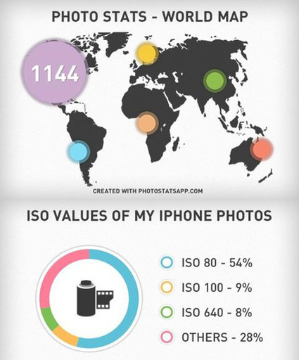
InFoto Free (http://goo.gl/6uM6r) InFoto Free is an app for your Android to create an infographic of your photo-taking habits, using a Photo stats analyzer. With InFoto Free you can create awesome looking high-res infographics from your photo collection. It tells you things like what time of the day you prefer to take photos in, whether you prefer horizontal or vertical orientations as well as your favorite city to shoot in.
Photo Stats (http://goo.gl/b8mB1) Photo Stats is an iPhone app that analyses the photos you take on your iPhone. The app generates cool and stylish infographics that shows how, when and where you take your photos from. You get to easily visualize your photo-taking habits and share it with friends.
More Tools
ChartsBin (http://goo.gl/kSZ2k) – An online tool to create your own interactive map instantly with no installation or coding needed, and you can embed the map in your own website or blog easily too.
Tableau Public (http://goo.gl/EkmM0) – A free application for your Windows computer that brings data to life. You can create and share interactive charts and graphs, stunning maps, live dashboards and fun applications in minutes. Anyone can do it, it’s that easy.
Creately (http://goo.gl/D3gx8) – Want to create beautiful diagrams in no time? Creately may be a good choice to use as it can be used across all sectors by individuals, corporate teams, developers, software architects, students and teachers alike for diagramming purposes.
Gliffy (http://goo.gl/x3O6n) – Gliffy helps to easily create professional-quality flowcharts, diagrams, floor plans, technical drawings, and more. You can easily drag-and-drop your way through the makings of an infographic using the many shapes from an extensive library.
SIMILE Widgets (http://goo.gl/TvzqR) – SIMILE is a free and open-source data visualization Web widget.
Tagxedo (http://goo.gl/2l0Uf) – Tagxedo turns words – famous speeches, news articles, slogans, themes, even your love letters – into a visually stunning word cloud. Every word is individually sized to highlight the frequencies of occurrence within the body of text.
Wordle (http://goo.gl/XS56D) – Wordle is a simple web app for generating “word clouds” from the text you provide. While the clouds give greater prominence to words that appear more frequently in the source text, you can also tweak your clouds with different fonts, layouts, and color schemes. Via 173 Sud, Chrisange , Rose Marie DeSousa, massimo facchinetti, Becky Gaylord, John van den Brink

's comment December 31, 2012 4:00 AM
GR8 Collection! TYVM John!

Alfredo Corell's curator insight,
January 8, 2013 6:47 PM
While not everyone can make infographics from scratch, there are tools available on the Web that will help you create your very own infographics. In this article, they-re listing more than 20 such options to help you get your messages across to your readers, visually.
Some of them really simple. Most of them... visual. Try, gooo 
Devrim Ozdemir, Ph. D.'s curator insight,
January 9, 2013 8:39 AM
While not everyone can make infographics from scratch, there are tools available on the Web that will help you create your very own infographics. In this article, they-re listing more than 20 such options to help you get your messages across to your readers, visually.
Some of them really simple. Most of them... visual. Try, gooo
From simple charts to complex maps and infographics, Brian Suda's round-up of the best – and mostly free – tools has everything you need to bring your data to life... A common question is how to get started with data visualisations. Beyond following blogs, you need to practice – and to practice, you need to understand the tools available. In this article, get introduced to 20 different tools for creating visualisations... Via Lauren Moss, Baiba Svenca, Jenny Pesina, João Greno Brogueira, Louise Robinson-Lay

Randy Rebman's curator insight,
January 28, 2013 12:33 PM
This looks like it might be a good source for integrating infographics into the classroom.
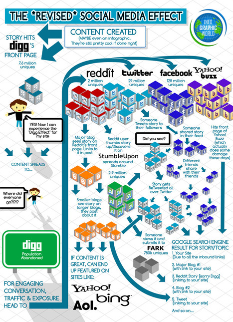
The following ===> infographic <=== covers the topic of social media and how it affects our content.
Would you imagine how social networking would be if there were no websites in the calibre of Stumble Upon, Twitter, Reddit, Digg, and Facebook ? I don't think we will have the same easy and instant access to the information as we do now.
We should be so thankful to those people behind the creation of such tools especially when we measure their importance and benefit in education. Via Gust MEES
|

![SEVEN STEPS TO THE PERFECT STORY [Fun Infographic] | A New Society, a new education! | Scoop.it](https://img.scoop.it/ZZ1mD2k-gErgFwW96DHNhzl72eJkfbmt4t8yenImKBVvK0kTmF0xjctABnaLJIm9)

![Social media for teachers [Infographic] | A New Society, a new education! | Scoop.it](https://img.scoop.it/8bn7TFef-UB428kxYiTitTl72eJkfbmt4t8yenImKBVvK0kTmF0xjctABnaLJIm9)


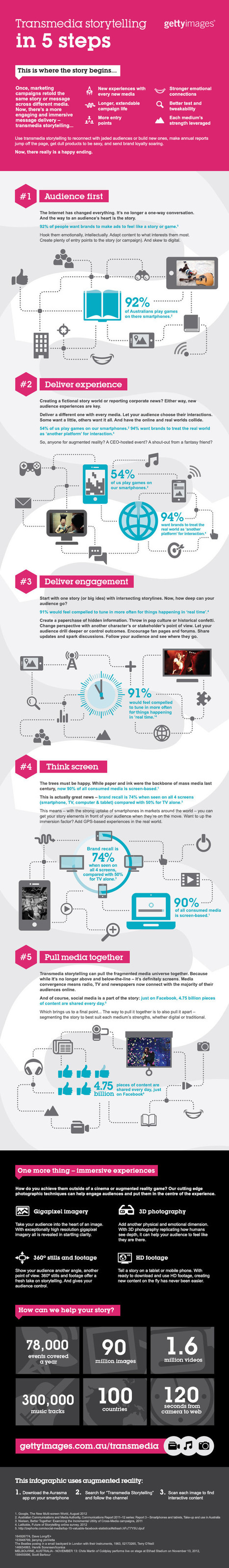
Marketing Magazine: "Transmedia storytelling is a marketing buzzword that will be around for a while – and for good reason."
[Also, use the Aurasma app to check out the augmented reality aspects of this infographic.]
Transmedia Storytelling is Now-Persuasion. #literacies
Digital storytelling is evolving rapidly. The infographic here justifies transmedia stories.